
BoneScope

How might we support EMTs in making fracture assessment with the wearable product in emergency situations?
Assessment Interface for Emergency Care
Impact
Improving task completion rate of bone fracture assessment and reducing cognitive load by ~70% among 5+ clinicians.
Increasing ML data labeling accuracy by 26%.
High-fi prototype and task flows delivered in 4 weeks, securing 100% stakeholder approval and alignment.
Role
Product Design Lead, UX Researcher
Apr 2025 - Present(involved from project initiation)
Being the only designer of the team, I own the design process of this product and the design system. I report directly to CEO, Dr. Tim Burdick.
Challenge
Develop a mobile-based medical app that -
guides step-by-step bone assessment procedures fast and with minimal cognitive load,
prepares analysis and medical reports for hospitals,
controls remote device with history records,
supports ML model training with data labeling,
Context
BoneScope is a medical wearable product using digital tuning fork to detect fractured bone without x-rays and has received funding awards from the Dartmouth Digital Health Accelerator 2025.
Moving into the development phase, the device needs a companion smartphone software that monitors and guides a complete assessment process, generates medical reports, and records patient data to continuously train the ML model, enabling more accurate predictions of fracture likelihood over time.
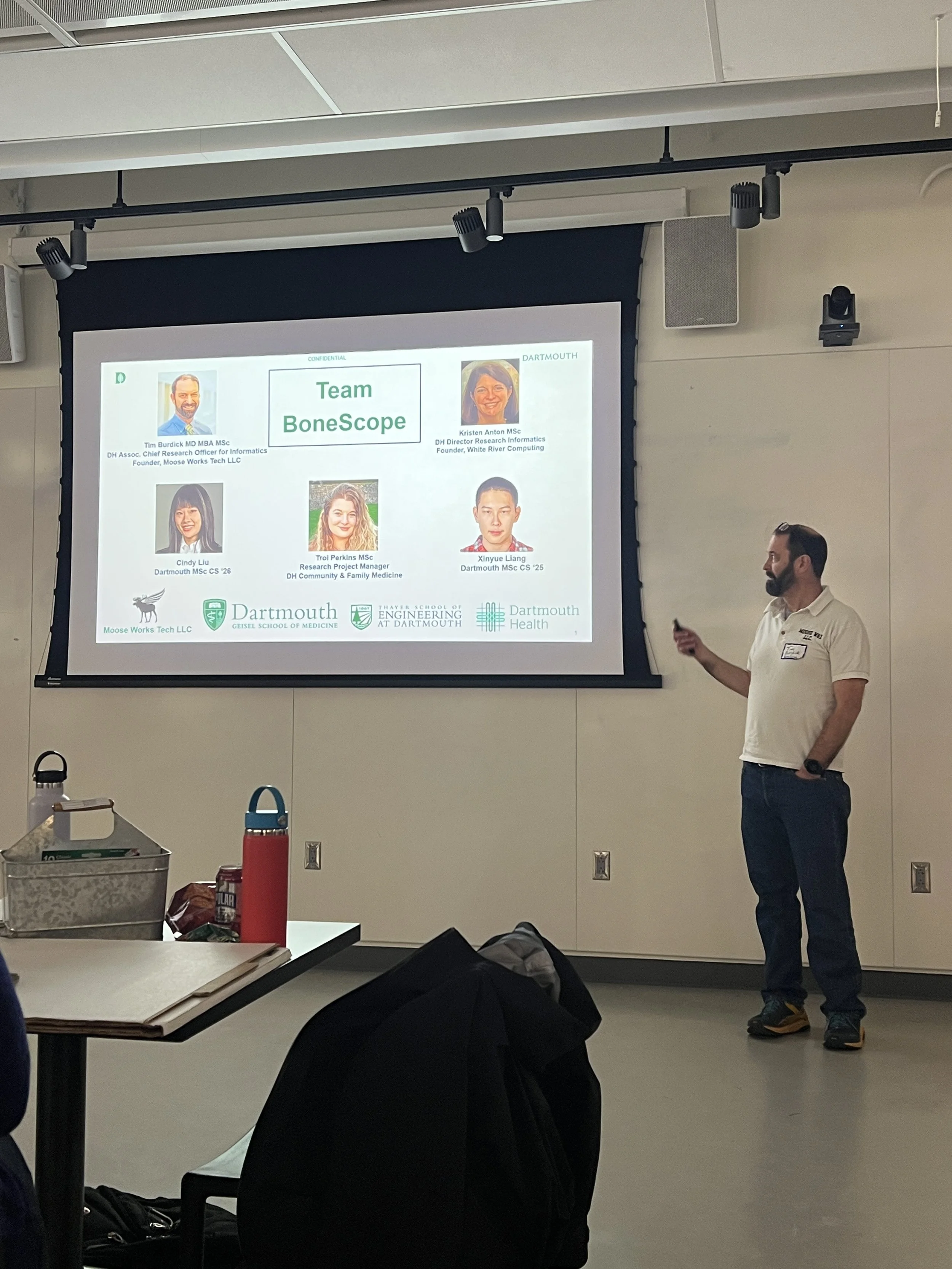
Team: Dr. Tim Burdick, Indrani Bhattacharya, Reet Kothari, Thomas Robinson, Stephen Adjei, Cindy Liu Jiayi
Background
I joined the Dartmouth Digital Health Accelerator 2025 as the sole designer on a 5-person team (2 clinicians, 2 engineers, and myself).
Building on Dr. Burdick’s sound-based prototype for fracture detection, we advanced the concept into a Go-To-Market product through journey mapping, pain point analysis, Pugh matrix evaluation, storyboarding, and test plan mapping.
I initiated the idea of a smartphone app as BoneScope’s digital “tuning fork,” leading early design exploration.
Our team’s work earned the $5,000 pitch competition award.

(Journey Mapping and Pain Points)
(Pitch Competition)
Preliminary Research
With 3 clinicians, 2 engineers, and 1 business advisor in our team, I led 3 Zoom meetings to understand product goals, user pain points, and market/clinical requirements.
3 Focus Group Sessions
I had conversational interviews with 2 clinicians for medical procedure walk-through, building up a task flow for bone assessment in line with clinical standards.
2 Field Studies
6 Insights
Fast, low-load workflow
Task flow must be quick and minimize cognitive effort.
Seamless sharing
Enable secure transfer of records and analyses to hospitals.
Clear, actionable data
Metrics and visualizations should be obvious and directly support decision-making.
User reassurance
Design should instill confidence and calm for EMTs in high-pressure scenarios.
State clarity
Interface must distinguish device on/off, connection control, and start/end of assessment.
ML-ready records
Input/output structured for continuous model training.
Early Ideation
How might we
Create a bone assessment task flow that is fast and low-cognitive.Minimize mandatory screens
I cut down the procedure steps to:
Start - Info Input - Device Action - Info Output
which in our task flow became:
Start - Patient Info - Scan - Result - Complete
Minimize inputs
To achieve recognition over recall, I designed selection-based input for date of birth, weight, and height with automatic unit conversion.
How might we
Allow the process records both available for hospital and ML model trainingReport page
I created a report page aside from the result to distinguish items available for printing and sharing to the hospital.
This allowed putting most necessary info first, while keeping clinical ready analysis optional to view.
Case-based labeling
The records are saved case by case instead of by patient. This way, not only do we protect patient privacy, we can also learn from assessments that are interrupted.
How might we
Reassure users with clear and actionable data. Other than the mandatory progress bar, I added time left and real-time signal strength, which ensures EMTs are always updated with the current status.
I also created consistent escape hatches including pause and back to last step to give EMTs more control in case of an unhappy path.
The wireframe defined the core user flow, structured information hierarchy, and decided the essential info for a medical user during the experience.
After sketching this, I saved 2 underlying user research questions for the next iteration:
Do users prefer instructions in the app? If so, what content and how?
Would having patient history or scan records saved in the app be valuable to users? If so, what content and how long to be retained?
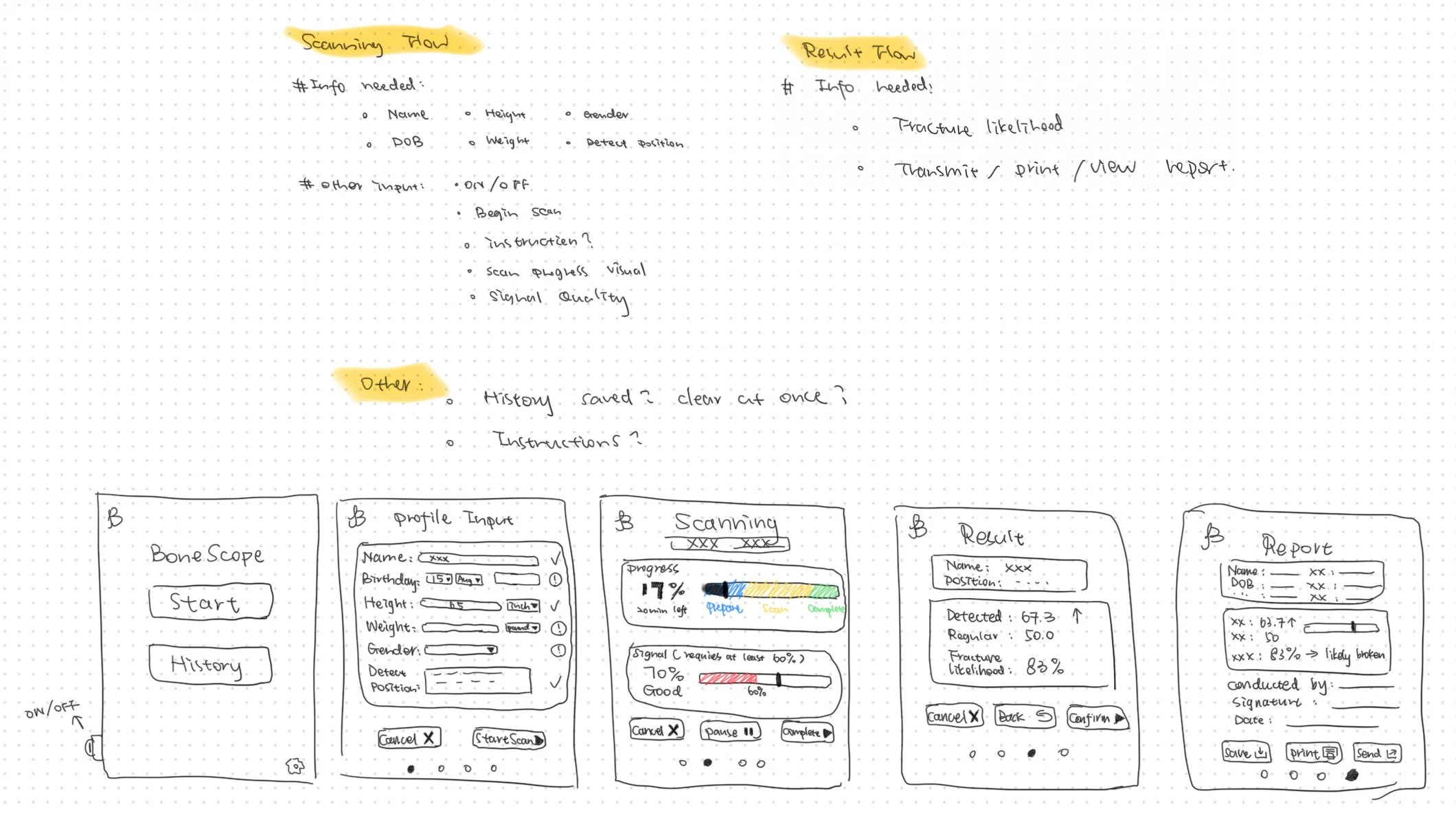
(Sketch for wireframe and notes)
Iterative User Research
I conducted user interviews combining moderated usability testing, A/B concept testing, think-aloud, and cognitive walkthroughs.
The interviewees refined the app’s wording to be more medically professional, shared their routine bone-assessment workflow, and confirmed the importance of instruction page and history records.
By observing their navigation and think-aloud feedback, I also captured confusion, points of friction, and preferences for potential features, leading my next step prototype design.

(part of my interview notes)
Iterative Design
Prototype V1
Translated the wireframe into a working visual prototype with functional layout and consistent navigation (back/next/stop). Introduced instruction page/modal, visual signal bars, and device selection flow.

Key Design Decisions:
Centralized data entry
Features informed by user research
Improved visual feedback & consistency
Prototype V2
Refined user flow, data grouping, visual hierarchy for better usability. Introduced “Positioning“ as an intermediary step. Reduced cognitive load by simplifying typography and standardized actions aligning with medical conventions.
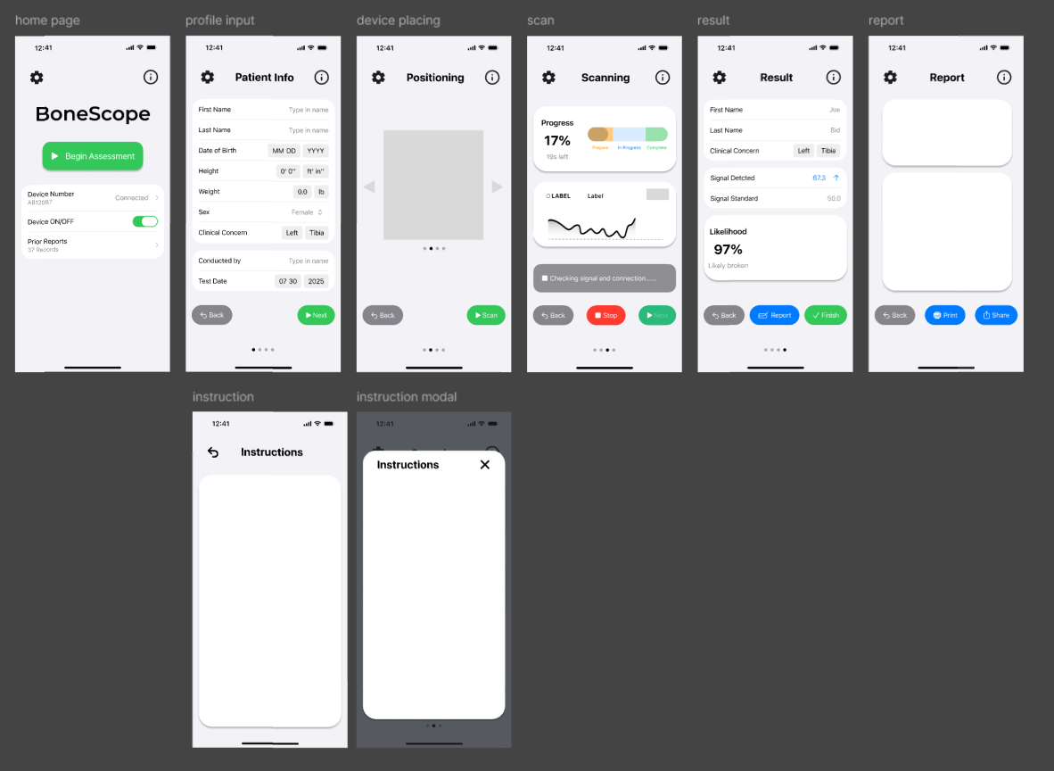
Introduced 3 features to enhance usability:
Instructions (page/modal) - Learnability, Just-in-Time Guidance, Onboarding, Training Independence.
Positioning - Guided Interaction, Error Prevention, Situational Awareness.
Device (selection/connection/history): User Control, System Status Visibility, System Distinguishment, Feedback Loop, Medical Standard Alignment.
Real-time feedback: from separate and textual progress bar and signal indicators, to color-coded bars + real-time signal visualization + percentage labels + dynamic feedback text.
Action button: from mixed position to aligning all primary actions at the bottom and consistent color coding.
Report clarity: from a dense layout with multiple fields to a clean card format, prioritizing fracture likelihood.
All user inputs were consolidated into a single “Patient Input“ screen. This design minimizes context switching, reduced cognitive and action load during scanning and reporting, thus accelerates the process.
High-Fi Prototype

Vibe Coding Demo
Besides designing in Figma, I created a working interactive prototype in Cursor using TypeScript and CSS. It included key features like device connection, positioning, instructions, and result display.
In addition to my own design, vibe coding with AI helped me learn mobile design regulations, including privacy & legal policy and report disclaimer.
Although some layout details were less refined than my final design mockups, the prototype bridged the communication among developers, engineers, and clinicians, helping to understand the product flow, interactions, and user experience. It clarified the product direction before full development.
Next Steps
As BoneScope
Following my internship completion, our CEO has shared the design and demo with Simbex, an R&D firm specializing in medical device development.
We are currently discussing patent strategy and development roadmap, aiming to build the first functional version of BoneScope for integrated hardware testing.
As Designer
I continue to collaborate with the team in a consultative role, supporting the project’s next phase while focusing on new design challenges ahead:
Collaborate with Engineers
Conduct User Validation
Develop Scalable Design System
Integrate ML × UX Design
Regulatory & Accessibility Alignment with FDA
What Did the Client Say?
“Cindy quickly proved herself to be an indispensable member of our team. She took the lead in shaping the design of our BoneScope companion software, mapping end-to-end diagnostic workflows and producing high-fidelity prototypes that bridged engineering and clinical perspectives.
She demonstrated impressive initiative by conducting user research with EMTs, translating complex clinical needs into clear, intuitive product requirements, and helping stakeholders across disciplines align toward a shared vision.
Her professionalism, creativity, and reliability set a strong foundation for BoneScope’s development and future clinical adoption.”
— Timothy E. Burdick, MD, CEO of Moose Works Tech LLC